CSS :valid and :invalid
The :valid in CSS is a pseudo class that allows you to select an <input> element whose content is correct, based on its type.
In other words, this pseudo class selects an <input> element whose content meets the criteria specified by its type and any additional constraints set by HTML5 validation attributes (such as required, pattern, min, max, etc.).
When the input data satisfies these constraints, the :valid pseudo-class is applied and styled the element accordingly.
The syntax for using the :valid pseudo-class in CSS is simple and straightforward that is as follows:
selector:valid {
   /* CSS styles go here */
}
In the above syntax, selector usually specifies an HTML form element like <input>, <textarea>, or <select> you want to style it.
Example 1:
<!DOCTYPE html>
<html>
<head>
<title>CSS Valid Input Example</title>
<style>
/* Style for valid input */
input:valid {
   border: 2px solid green;
   background-color: #e0ffe0;
}
</style>
</head>
<body>
 <form>
    <label for="name">Name (required):</label>
    <input type="text" id="name" name="name" required>
    <button type="submit">Submit</button>
 </form>
</body>
</html>
Output:
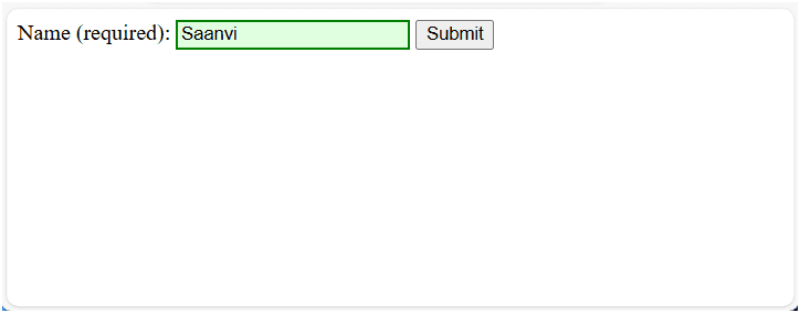
In this example, we have used :valid pseudo class to style the text input field with the required attribute. This means the field must contain some text to be considered valid.
The selector input:valid: styles the input field when it contains any text. If the input field contains any text, the selector input:valid applies a green border and a light green background. If the field is empty, it will not be considered valid, and the default styling remains.
CSS :invalid Pseudo Class
This pseudo class allows us to select an <input> element whose content is incorrect, based on its type.
In other words, the :invalid pseudo-class in CSS selects an <input> element whose content does not meet the criteria specified by its type and any additional constraints. When the input data does not satisfy these constraints, the :invalid pseudo-class is applied, and styled the element accordingly.
The syntax for using the :invalid pseudo-class in CSS is simple that is as follows:
selector:invalid {
   /* CSS styles go here */
}
How :invalid Works
1) Validation Criteria: The validity of an input element is determined based on the constraints you set. For example:
- When the user leaves the required field empty, it will be considered as invalid.
- An input element with a type of email that doesn’t contain a properly formatted email address is invalid.
- A text input with a pattern that doesn’t match the specified regex is invalid.
2) Styling with :invalid: You can apply CSS styles to input elements when they are in an invalid state. This helps users easily identify which input fields need attention.
Let’s take an example in which we will see the use of :invalid pseudo class in CSS.
Example 2:
<!DOCTYPE html>
<html>
<head>
    <title>CSS :valid and :invalid Pseudo Classes Example</title>
<style>
input:valid {
   border: 2px solid blue;
}
input:invalid {
   border: 2px solid red;
}
</style>
</head>
<body>
<form>
   <label for="email">Email:</label>
   <input type="email" id="email" name="email" required>
   <button type="submit">Submit</button>
</form>
</body>
</html>
Output:

In this example, we have a form element that contains a single email input field with the required attribute. This means the field must contain a valid email address to be considered valid.
The input:valid selector applies CSS styles to the input field when the entered email address is in a valid format. If the entered email is valid, the input field for the email address will be blue in color.
The input:invalid selector applies the CSS styles to the input field when the entered data does not meet the validity criteria. For example, if the email address is not in a valid format or the field is empty. If the entered email is not valid, the input field will have a red border and a light red background color.
Example 3:
<!DOCTYPE html>
<html>
<head>
    <title>Valid and Invalid Input Example</title>
<style>
/* Style for invalid input */
input:valid {
   border: 2px solid blue;
   background-color: #e0ffe0;
}
/* Style for invalid input */
input:invalid {
   border: 2px solid red;
   background-color: #ffe0e0;
}
</style>
</head>
<body>
<form>
   <label for="phone">Phone Number (10 digits):</label>
   <input type="tel" id="phone" name="phone" pattern="\d{10}" required>
   <button type="submit">Submit</button>
</form>
</body>
</html>
In this example, we have defined an input field for the phone number that has a pattern=”\d{10}” attribute, meaning it must contain exactly 10 digits to be valid.
When the input is valid, the input:valid selector applies the CSS styles to the input element and change the border color blue and background color light green.
When the input data is invalid, the input:invalid selector is triggered, it changes the border red and light red background to indicate the invalid state.
In this tutorial, you have learned :valid and :invalid pseudo classes in CSS with the help of various examples. I hope that you will have understood the basic syntax and practiced all examples.